Hey everyone! Pinterest graphic design is key to our blogs.
There, I said it PINTEREST is important. Why you may ask?
Because we all know how important blogging is to us. Our site is practically our child!
To care for your child, you need to help it grow and there’s a few important aspects to keep in mind, promotion being one of them.
For one, you want to create content more so than not.
If you’re afraid of creating TOO much you have the complete opposite idea of how a blog works.
The more content you create, the greater your reach across the web is. Relying solely on SEO to gain a following could take months or even years to accumulate.
There has to be a more efficient way…
It’s 2017 and the digital age has taken full swing. Social media isn’t just for teenagers wishing to post about the hip sushi they ate or the movie they just saw.
Deep down sites like Facebook, Twitter, and Pinterest are more or less marketing tools when optimized to your advantage.
Pinterest graphic design for example is, in my humble opinion, the easiest way to grow organic traffic to your blog.
“But I don’t know how to utilize Pinterest Graphic Design to promote my blog” said 97% of you reading this.
Am I right?
Don’t sweat it, I’m going to give you my Secret to creating Grade “A” Pins that will make people think you paid someone PROFESSIONAL to make them!
Why is Pinterest the Easiest social media platform to grow organic traffic?
I’m glad you asked!
Pinterest isn’t just for stay-at-home moms who want to share baking recipes.
There are tens of thousands of bloggers promoting their newest blog post or affiliate product they reviewed.
Those bloggers are in ANY niche you could imagine, don’t be discouraged thinking yours is too far-fetchedT.
They create a Pinterest graphic using Pinterst graphic design TOOLS like Adobe Photoshop, Canva, or PicMonkey.
These tools make creating blog promoting images a snap when you let your creative juices flow!
Personally, I use Canva for my Pinterest graphic design because it has an intuitive interface that allows me to glide through the design process.
Here’s a nifty little link to canva for you to follow along! Create a simple FREE account and get started.
Top 7 Keys to Create Eye-Catching Pins!
1. The Background image
People often think the background image does not really matter with Pinterest graphic design (s).
Look at this…
Does that make you want to click?
Does it give you the insight that this post has something of VALUE to you?
Good, just checking I wasn’t the only one…
Now compare the first one to this:
Which one caught your eye the most?
I also added boxes behind the text and lowered the opacity so you could still see the background. (Another one of my personal touches)
Notice how every little detail really makes a difference.
Sometimes you can underline words, bold text, or even add random shapes in. Whatever you feel looks great and attracts your buyer intent visitors.
**NOT EVERYTHING WILL WORK!
The background sets the overall tone and either catches your viewers eyes or turns them away in an instant!
Whatever you do, DO NOT just pick some random picture thinking it will work. Try and find an image that relatively relates to or is an exact match to your niche!
Pinterest graphic design is an art when it comes down to it.
Sloppy pins will get sloppy results!
2. The Font
When creating pins, it’s incredibly important to think of which fonts are too intense and which ones are just right.
Fonts also add to your overall branding. Most Pinterest graphic design creators use the same font sets, that way their followers look at their news feed and recognize their pin rather instantly.
I personally don’t use more than three different fonts per pin. Even the blogging gurus say too many overloads your viewers.
Here’s my Pinterest graphic design from before except now I’ve added excessively vibrant fonts that almost hurt your eyes, right?
Now Here’s that pin with a couple of fonts I use with almost every pin I create.
(Again, I can’t stress enough how important branding is to your blog and Pins!)
Do some A/B split testing and see which one your visitors respond to the most.
3. Font Colors
You do not want a rainbow on your pins.
You DO NOT want a rainbow on your pins.
Sorry, I just despise when pinners think making a strobe light of colors with their text catches my attention.
IT DOESN’T!
(FYI Bright Pink is not a good choice for Pinterest graphic design…)
Stick to one or two colors that do not make you want to claw your eyes out.
Here, I’ve added colors to the fonts and only strayed from the primary font color to create emphasis.
4. Background Color/ Color Overlay
Some graphic designers choose to take away from the natural color of the background images and add a color tint to it.
This practice is either, again part of branding, or just a creative addition to a pin.
Not a bad thing by any means! Here’s my pin with a yellow hue.
I personally think this looks HORRIBLE in some situations.
However, sometimes trying new things leads to sales conversions!
I won’t ever be able to say it enough; Try new things!
Your brand is everything to your success as a blogger.
5. Your Logo/ Website!
You want, no NEED to let your followers know that you created this Pin!
Not only does this help with people stealing your pins and breaking copyrights, but it also puts the finishing touches of branding to your pins.
*IT’S YOUR PIN. BE PROUD OF IT!*
Ta Da! There she is!
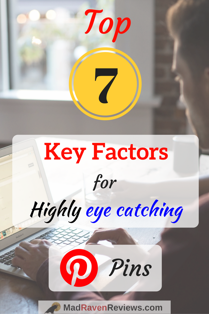
The final product. Is is extravagent?
No.
But does it make you want to know what the 7 key factors for highly eye catching pins are?
Absolutely!
I know I said to think outside of the box and add visually appealing elements to your pins, but sometimes there is a thing as too much.
Before you publish your pins, always check your details and ensure you didn’t make any mistakes I.e. misspelling your website name 😉
6. Pinterest Graphic Design – Description
This is by far one of the most important aspects of a Pinterest Pin in particular.
Keywords
Keywords
KEYWORDS!
I can’t STRESS ENOUGH how keywords and SEO (search engine optimization) means an incredible amount!
When you think of Pinterest, you don’t think of it as a search engine at all.
With images being the only aspect of the site, they needed something to allow their user’s images to be found.
Pinterest introduced their Smart Feed which relies almost completely on Pin descriptions for pins to be found.
Keyword and keyword phrases are usually really descriptive, but relatively short too.
I personally use a tool called the Jaaxy Keyword Tool which searches all of the major search engines and gives you a list of keywords that would suit your search term.
It shows you the highest optimized as well as the lowest terms people search.
For example, if you had a post that helped let you choose the gender of your child you want to conceive like my post HERE, you would want it to be a strong term.
“Determine baby gender” is too vague and has a ton of competition as shown here by the Jaaxy Keyword Tool I use.

“Ways to determine baby gender” has a low competition, high ranking score.

These keywords combined with an eye catching image is how you get your post noticed and have your followers coming back time and time again!
Here, give Jaaxy a quick try below. All you have to do is create an account really quick for free and they’ll let you search 30 FREE search terms on us.
There are no catches, and they don’t even ask for payment info before you try it.
If you’re like me and would rather see an HONEST review of Jaaxy, you can look at our review of the Jaaxy Keyword Tool right
HERE.
Final thoughts
Now you know the fastest, easiest way to identify the attributes that make pins and other graphics POP!
There is no better feeling than getting the notifications saying “This Person shared your pin!” and “This Person followed you!”
It’s all because you created those eye-popping pins that got their attention, kept them reading the description, and had them clicking through to your site!
P.S….
Your Pins are also fantastic graphics to set as the “Featured image” on your blog roll and also sprinkle in the post!
Repurposing your blog content is another helpful tactic to becoming a blogging guru.
Don’t feel bad either about not knowing what you’re doing at first, we’ve ALL been there…
Take the tricks I’ve shown you here and keep learning more ways to create your brand.
P.s.s
Yes I made an oopsy.
When I initially created this pin, I thought I had created 7 key factors rather than 6 key factors for Pinterest graphic design.
It’s the content that matters right? 😉 Until next time,
Kevin
Mad Raven Reviews


